- Specify a text box as the list editor input. This is the default and is used if no input area is configured in the XML.
- Use the <default> child element any number of times to add default items to the list.
- Set the <minimum> child element to specify the minimum items users may add to the list.
- Set the <maximum> child element to specify the maximum items users may add to the list.
- Optional: Specify a regular expression using the <regex> child element.
<component id="zip_code_list">
  <description>List of ZIP Codes</description>
  <list-editor>
    <default>84043</default>
    <default>30052</default>
    <minimum>1</minimum>
    <maximum>5</maximum>
    <regex>^\d{5}$</regex>
  </list-editor>
</component>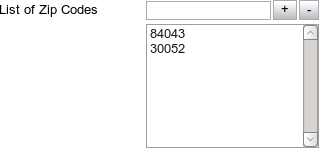
- Specify a select box as the list editor input.
- Use the <select-value> element to preset default options in the list editor.
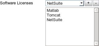
<component id="licenses">
  <description>Software Licenses</description>
  <list-editor>
    <select-value>Matlab</select-value>
    <select-value>NetSuite</select-value>
    <select-value>Tomcat</select-value>
    <select-value>Windows Server 2008</select-value>
    <select-value>Microsoft Office 2010</select-value>
    <select-value>Adobe Acrobat 9</select-value>
  </list-editor>
</component>
- Specify a suggest box as the list editor input.
- Use the <suggest-box> element. See Configuring a suggest box.
- Specify the list editor input as inferred values.
- Insert the <inferred-value> element.
- Set the source attribute to "moab", the type attribute to "node-name", and the component attribute to "suggest"
- Specify the list editor input as a composite list.
- Insert the <composite-list-editor> element.
- Set the <display-value> element to determine how any new item in the list should be displayed.
- Set the <api-value> element to determine the internal, hidden value of any new item.
- Optional: Set the <add-text> element to specify the desired text of the “Add” button.
- Optional: Set the <remove-text> element to specify the desired text of the “Remove” button.
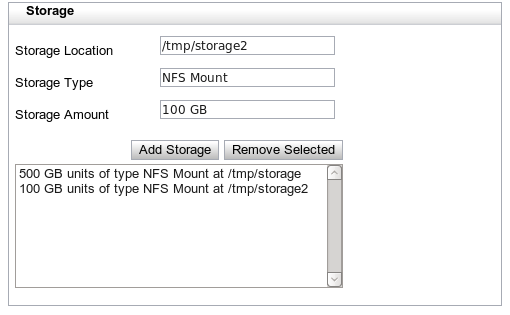
<component id="storage-list">
  <composite-list-editor>
    <add-text>Add Storage</add-text>
    <api-value>
      <calculate operation="append-in-order">
        <value order="1">
          <component id="storage-amount" />
        </value>
        <value order="2">:</value>
        <value order="3">
          <component id="storage-type" />
        </value>
        <value order="4">@</value>
        <value order="5">
          <component id="storage-location" />
        </value>
      </calculate>
    </api-value>
    <display-value>
      <calculate operation="append-in-order">
        <value order="1">
          <component id="storage-amount" />
        </value>
        <value order="2"> units of type </value>
        <value order="3">
          <component id="storage-type" />
        </value>
        <value order="4"> at </value>
        <value order="5">
          <component id="storage-location" />
        </value>
      </calculate>
    </display-value>
  </composite-list-editor>
</component>

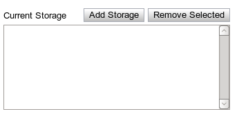
A description is not required for this component. However, if one is specified, it will be placed in the upper left section of the widget: