4.3 Configuring the Components Element |

|
4.3 Configuring the Components Element |
|
Each component has the following attributes (with the exception of <label>. The <label> component does not support required or editable):
id (required) - Any unique name.description (optional) - Any string. The description is used as a label in the GUI for the component. The default is an empty string.required (optional) - States if the component is required (the user must enter data to pass page validation). The default is "false".editable (optional) - States if the component is editable by the user. The default is "true".permission (optional) - Specifies which permissions are required to view the component. The value can be any permission. This is supported by all components in Viewpoint 1.1 and later. For more information about permissions, see Permissions. Here is an example of a component that requires the "power-user" permission to see the priority component:
<component id="priority" required="false" permission="power-user">
  <description>Priority</description>
  <number-value type="int">
    <default>0</default>
    <minimum inclusive="true">-10000</minimum>
    <maximum inclusive="true">10000</maximum>
    <step>1</step>
  </number-value>
</component>
The order in which these components are created makes no difference in the user interface as the <page> elements contain the layout of these components.
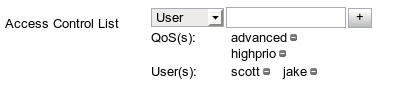
An ACL editor is a component that can be used to create or modify any access control list. An access control list is a list of credentials that have or will have access to the base object. There are 2 input areas for any ACL editor: the credential type and the credential name.
The credential types are User, Account, Class, Group, or QoS. After selecting the type, enter the credential name in the text area to the right. As text is entered, suggestions for credential names, that match the type specified, will appear. Add credentials by pressing Enter on the keyboard.

To remove an item from the list, click on the "-" icon to the right of the credential.
Specify an ACL editor by using the <acl-editor> element to define a component. Here is an example from the default create reservation configuration:
<component id="aclEditor">
  <description>Access Control List</description>
  <acl-editor />
 </component>
Help Text can be added for all implemented components. To add help text place <help-text> tag with desired text as shown below. Help text will appear immediately below component. HTML tags are accepted in this tag, but must be wrapped in a CDATA tag (see the second example below):

<component id="class" required="false">
  <description>Class</description>
  <help-text>This is the help text</help-text>
  <text-value />
</component>
Example of Help Text with HTML:
<component id="class" required="false">
  <description>Class</description>
  <help-text><![CDATA[Desired <a href="http://www.desired-web-page.com">Web Page</a>]]></help-text>
  <text-value />
</component>

A check box is specified using a <boolean-value> element. The user clicks on the checkbox to change the value from true to false and vice-versa. The default is false unless there is a specified default value of true using the <default> child element.
The following describes a check box that allows a user to request a development environment. Note that the logic to show the advanced options is specified under the <navigation> element, not the <components> element.
<component id="isDevelopment" required="true">
  <description>Development</description>
  <boolean-value />
    <default>true</default>
</component>

A date box is specified by using a <date-value> element. A date box allows users to input a date value. Restrictions can be placed on the date box to define what are valid dates using the <earliest-date> and <latest-date> elements (timezone values are ignored). Like other components, the default date can be specified by using the <default> element.
Specified dates in the XML can be absolute or relative. Dates are assumed to be absolute, but relative dates can be specified by using the relative attribute of <earliest-date> and <latest-date>. An absolute date always corresponds to the exact same time, whereas a relative date is in relation to the current time on the server. July 4, 1776 is absolute, but '3 days from today' is relative.
To specify a date, the following elements can be set in the XML:
The text in each of these elements must be an integer value. Any value not set is assumed to be 0. Users may specify values above the theoretical maximum and they will be converted (for example 25 hours would correspond to +1 day and 1 hour).
The following describes a date box component that must be after July 4, 1776 and before today.
<component id="birthday" required="true">
  <description>Birthday</description>
  <date-value>
    <earliest-date relative="false">
      <years>1776</years>
      <months>7</months>
      <days>4</days>
    </earliest-date>
    <latest-date relative="true" />
  </date-value>
</component>
Duration components are specified by the <duration-value> element with a type attribute. There are two different types. The "text" type creates a duration text box and the "spinner" type creates a duration spinner.
The <duration-value> element has three child elements that are common to both duration types, but the "spinner" type has an additional element. The child elements of <duration-value> are:
default> - This element allows you to define a default value for each period type. The default value is displayed to the user.minimum> - With this element you can specify the maximum allowable value for each period type.maximum> - With this element you can specify the minimum allowable value for each period type.display> ("spinner" type only) - This element allows you to display a number spinner for each period type.These four elements have one common child element called <time-period>. The <time-period> element has several child elements that correspond to time period types:
<duration-value type="spinner">   <!-- Type should be "text" or "spinner".  -->
  <default>                <!-- You can specify a default value for any     -->
    <time-period>          <!-- period type listed above.                   -->
      <days>14</days>      <!-- Here, a default value of 14 is displayed    -->
      <hours>6</hours>     <!-- to the user for the 'days' entry and '6' is -->
    </time-period>         <!-- displayed for the 'hours' entry.            -->
</default>
  <minimum>                <!-- Minimum and maximum values can be specified -->
    <time-period>          <!-- for each period type.                       -->
      <hours>4</hours>
    </time-period>
  </minimum>
  <maximum>
    <time-period>
      <years>2</years>
    </time-period>
  </maximum>
  <display>                <!-- This works for only the "spinner" duration  -->
    <time-period>          <!-- type. Using this element creates a spinner  -->
      <months>1</months>   <!-- for each time period that you specify. A    -->
      <days>1</days>       <!-- time period with a value of '1' displays a  -->
      <hours>1</hours>     <!-- number spinner for that time period type on -->
    </time-period>         <!-- the GUI.                                    -->
  </display>
</duration-value>
The duration text box component is the default duration component and can be specified with type="text". Expand the code window below for an example of what the code for a duration text box component might look like.
<duration-value type="text">
  <default>
    <time-period>
      <years>1</years>
      <months>1</months>
      <days>0</days>
      <hours>0</hours>
      <minutes>0</minutes>
      <seconds>0</seconds>
    </time-period>
  </default>
  <minimum>
    <time-period>
      <years>0</years>
      <months>0</months>
      <days>0</days>
      <hours>0</hours>
      <minutes>0</minutes>
      <seconds>0</seconds>
    </time-period>
  </minimum>
  <maximum>
    <time-period>
      <years>100</years>
      <months>100</months>
      <days>365</days>
      <hours>24</hours>
      <minutes>60</minutes>
      <seconds>60</seconds>
    </time-period>
  </maximum>
</duration-value>

You can configure the <duration-value> component to display number spinners instead of a text box by using the type="spinner" attribute. The <display> child element is used to specify how many spinners should be available for entering time information. A value of 1 adds the corresponding spinner to the component. If the <display> element is missing, no spinners are added. If any time period elements are missing, the spinner for those period types are not added. If a time period element is nested in the <time-period> and <minimum> or <maximum> elements, the number spinner cannot be set to less than or more than the specified value.
Expand the code window below for an example of what the code for a duration spinner component might look like.
<duration-value type="spinner">
  <default>
    <time-period>
      <years>1</years>
      <months>2</months>
      <days>0</days>
      <hours>0</hours>
      <minutes>0</minutes>
      <seconds>0</seconds>
    </time-period>
  </default>
  <display>
    <time-period>            <!-- These are not the displayed, default,     -->
      <years>1</years>       <!-- maximum, or minimum allowable values.     -->
      <months>1</months>     <!-- A value of '1' in the <display> element   -->
      <days>1</days>         <!-- means only that the spinner should be     -->
      <hours>1</hours>       <!-- displayed to the user.                    -->
      <minutes>1</minutes>
      <seconds>1</seconds>
    </time-period>
  </display>
  <minimum>
    <time-period>
      <years>0</years>
      <months>0</months>
      <days>0</days>
      <hours>0</hours>
      <minutes>0</minutes>
      <seconds>0</seconds>
    </time-period>
  </minimum>
  <maximum>
    <time-period>
      <years>100</years>
      <months>100</months>
      <days>365</days>
      <hours>24</hours>
      <minutes>60</minutes>
      <seconds>60</seconds>
    </time-period>
  </maximum>
</duration-value>
A file upload component allows users to upload files from their local computer to the cluster head. To add a file upload component, use the <file-upload> element. This element has no attributes, but has four optional specification child elements.
server-path> - This specifies a temporary path on the server where the file should be uploaded. This must be a fully qualified path.cluster-path> - This specifies the final destination path of the file on the cluster head. This must be a fully qualified path.max-file-size> - This specifies the maximum allowable file size (in bytes) users can upload.form-submit> - This specifies an alternative Servlet or other form action URL.

|
The server and cluster paths must be different if you are using an ssh connection to the localhost for Moab, otherwise the file will be deleted. |
The default value for each child component is shown in the example below:
<file-upload>
  <server-path>/tmp</server-path>
  <cluster-path>/var/tmp</cluster-path>
  <max-file-size>10000000</max-file-size>
  <form-submit>/fileupload/file</form-submit>
</file-upload>
The inferred values component enables you to have a drop-down menu that is generated at the time the page is loaded, instead of when the configuration file is read. This enables you to configure a component that has dynamic values that change depending on the current state of your environment. There are two ways to source the values that populate the dynamic drop-down menu:
By default, a drop-down menu is used for inferred values. In Viewpoint 2.0 and later you can instead use a suggest box component by specifying the component attribute and setting the value to "suggest". In this case, instead of a drop-down box where the user selects one of the choices, the user is presented with a text box with suggestions populated as the user types. Here is an example of an inferred value that uses a suggest box:
<inferred-value source="Moab" type="node-name" component="suggest" />
When reading in from a file or from the return value of a script, the <inferred-value> child element of the <component> element looks something like this:
<component id="node_selection" required="false">
  <description>List of nodes available</description>
  <inferred-value cardinality="one" source="file">
    <url value="file:///availableNodes.xml" />
  </inferred-value>
</component>
The cardinality attribute is used only if the inferred value that is read in is a <select-value> (which is parsed into a drop-down menu), and indicates that either "one" or "many" items can be selected at once.
When using a URL to obtain the data, the source attribute of the <inferred-value> has two values that indicate the type of read-in you want to perform:
"exec" - This indicates that the <url> child element contains the location of an executable that returns valid XML to populate the component."file" - This indicates that the <url> child element contains the location of an XML file. The file must contain valid XML of a Viewpoint component.Because the <inferred-value> element is already wrapped in the <component> element, all that needs to be read-in from the script or file is the component details. Here are two examples of valid returns to the <inferred-value> element:
<select-values>
  <select-value api-value="a" display-value="Value A" />
  <select-value api-value="b" display-value="Value B" />
</select-values>
<number-value type="int">
  <default>1</default>
  <minimum>2</minimum>
  <maximum>8</maximum>
  <step>1</step>
</number-value>
When the source attribute is "Moab", the component type automatically becomes a drop-down menu. The values that populate the drop-down menu come from Moab and can change upon a page refresh or page load. An example of a Moab- generated component looks like this:
<component id="node_features" required="false">
  <description>Payment Type</description>
  <inferred-value cardinality="one" source="Moab" type="node-feature">
</component>
The type attribute indicates which values Viewpoint should retrieve from Moab. The valid types for a Moab-inferred value are:
"account" - A list of accounts the user has access to."class" - A list of the classes the user has access to."gres" - All generic resources."group" - A list of groups the user has access to."hypervisors" - A list of hypervisors."node-feature" - All node features."node-name" (Viewpoint 2.0 and later ) - A list of the the names of all nodes."partition" (Viewpoint 2.0 and later) - A list of all of Moab's partitions."qos" - All quality of service (QoS) levels the user has access to."vcprofile" - All VPC profiles."vm-os-list" - A list of the VM operating systems that Moab is aware of.

The <label-value> component allows you to display unmodifiable text.
<label-value>Operating System Information</label-value>

A single select list box is specified using a <select-values> element and specifying a cardinality of "one". The <select-values> element requires one or more <select-value> child elements. Each <select-value> child element represents a single option in the single select list box (also known as a drop-down box). The <select-value> element has two attributes:
api-value - This attribute is the information that is used as the value of the drop-down box, but is not seen by the user. This value is sent to Moab.display-value - This is what is displayed to the user, but is not the value of the box. This value is not sent to Moab.The following describes a single select list box where the user can choose a single operating system. There are two values for each operating system, the display name (which contains spaces and an easy-to-read description), and the api value which is what Moab uses for the OS value.
<component id="os" required="true">
  <description>Operating System</description>
  <select-values cardinality="one">
    <select-value api-value="RhelAS4u6x86Stig" display-value="RedHat AS 4.6 32bit-STIG" />
    <select-value api-value="RhelAS4u6x86Stig_64" display-value="RedHat AS 4.6 64bit-STIG" />
    <select-value api-value="RhelES5u1x86Stig" display-value="RedHat ES 5.1 32bit-STIG" />
    <select-value api-value="RhelES5u1x86_64Stig" display-value="RedHat ES 5.1 64bit-STIG" />
    <select-value api-value="Win2003EEr2x86Stig" display-value="Win 2003 Ent 32bit-STIG" />
    <select-value api-value="Win2003EEr2x86_64Stig" display-value="Win 2003 Ent 64bit-STIG" />
  </select-values>
</component>
|
|
All validation and rule descriptors use the api-value attribute when getting the value of a single select list box. |
If a value other than the first item in the list is desired as the default, the <default> element should be used. To set a default, use the <select-value> element as a child of the <default> element as in this example:
<component id="os" required="true">
  <description>Operating System</description>
  <select-values>
    <default>
      <select-value api-value="Win2003EEr2x86_64" display-value="Win 2003 Ent 64bit" />
    </default>
    <select-value api-value="RhelAS4u6x86" display-value="RedHat AS 4.6 32bit" />
    <select-value api-value="RhelAS4u6x86_64" display-value="RedHat AS 4.6 64bit" />
    <select-value api-value="RhelES5u1x86_64" display-value="RedHat ES 5.1 64bit" />
    <select-value api-value="Win2003EEr2x86_64" display-value="Win 2003 Ent 64bit" />
  </select-values>
</component>
By default, the items in a select list box are listed according to their ordering in the XML. The sort attribute can be set in the <select-values> element to sort the values alphabetically (according to their <display-value>) as in this example:
<component id="os" required="true">
  <description>Operating System</description>
  <select-values sort="true">
    <select-value api-value="Win2003EEr2x86_64" display-value="Win 2003 Ent 64bit" />
    <select-value api-value="RhelAS4u6x86_64" display-value="RedHat AS 4.6 64bit" />
    <select-value api-value="RhelES5u1x86_64" display-value="RedHat ES 5.1 64bit" />
  </select-values>
</component>
A list editor is a component that allows users the ability to add strings to a list. It is configured using the <list-editor> element. This component has an input area that allows a user to input a string value and buttons on the side for adding or removing items in the list.
To add a value to the list box, the user enters a value into the input component and clicks the "+" button. If the user wants to remove a value from the list, they select one or more items on the list and click the "-" button.
The list editor widget currently supports default values as well as enforcing a minimum and maximum number of items in the list. Unlike other components, there may be more than one <default> elements. Each default element will add another item to the list.
There are four types of widgets that can be used for inputs to a list editor component:

The text box is the default value for <list-editor> and is used if no input area is configured in the XML. You can specify a regular expression for the text box using the <regex> child element.
<component id="zip_code_list">
  <description>List of ZIP Codes</description>
  <list-editor>
    <default>84043</default>
    <default>30052</default>
    <minimum>1</minimum>
    <maximum>5</maximum>
    <regex>^\d{5}$</regex>
  </list-editor>
</component>

The list
editor also accepts a list box for inputs. To specify a list box, use the
<select-values> element. This element has the same syntax as any other select box (also known as List Box).
<component id="licenses">
  <description>Software Licenses</description>
  <list-editor>
    <select-value>Matlab</select-value>
    <select-value>NetSuite</select-value>
    <select-value>Tomcat</select-value>
    <select-value>Windows Server 2008</select-value>
    <select-value>Microsoft Office 2010</select-value>
    <select-value>Adobe Acrobat 9</select-value>
  </list-editor>
</component>
The third type of input accepted by the list editor is a suggest box. To specify a suggest box, use the <suggest-box> element. For more information on suggest boxes, see Suggest Box.
A list editor can also be configured to use an inferred value as the input to the list. To specify an inferred value, use a child <inferred-value> element.
<component id="hostlist">
  <description>Host List</description>
  <list-editor>
    <inferred-value source="moab" type="node-name" component="suggest"/>
  </list-editor>
</component>

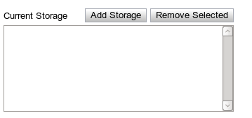
A composite list editor component allows users to select from a list of components on the existing page. To specify a composite list editor, use the <composite-list-editor> element.
This element has 3 child elements:
display-value> - This is a string value decider that determines how any new item in the list should be displayed.api-value> - This is a string value decider that determines the internal, hidden value of any new item.add-text> (Optional) - This optional element specifies the desired text of the "Add" button.remove-text> (Optional) - This optional element specifies the desired text of the "Remove" button.
<component id="storage-list">
  <composite-list-editor>
   <add-text>Add Storage</add-text>
    <api-value>
     <calculate operation="append-in-order">
      <value order="1">
       <component id="storage-amount" />
      </value>
     <value order="2">:</value>
     <value order="3">
      <component id="storage-type" />
     </value>
     <value order="4">@</value>
     <value order="5">
      <component id="storage-location" />
     </value>
    </calculate>
   </api-value>
   <display-value>
    <calculate operation="append-in-order">
     <value order="1">
      <component id="storage-amount" />
     </value>
     <value order="2"> units of type </value>
     <value order="3">
      <component id="storage-type" />
     </value>
     <value order="4"> at </value>
     <value order="5">
      <component id="storage-location" />
     </value>
    </calculate>
   </display-value>
  </composite-list-editor>
</component>
A description is not required for this component. However, if one is specified, it will be placed in the upper left-hand section of the widget.

A multi-select list box component allows users to select one or more items in a list. The [Ctrl] key is used to select multiple items. To use the multi-select list box, specify a <select-values> element with a cardinality attribute that has a value of "many".
|
|
A <select-values> element with a cardinality="one" attribute uses the (single select) List Box. |
For the purpose of the multi-select list box, the <select-values> element has three child elements:
default> - This specifies what the initial selection should be.maximum> - This specifies how many items must be selected at a minimum.minimum> - This specifies the maximum number of items that can be selected.select-value> - This specifies what items should appear in the list that can be selected.The api-value and display-value attributes of <default> and <select-value> determine what is displayed in the list and how the values in the list are interpreted.
In the example below, the multi-select component is invalid when less than two, or more than three, items are selected.
<select-values cardinality="many">
  <maximum>3</maximum>
  <minimum>2</minimum>
  <default api-value="RhelAS4u6x86" display-value="RedHat AS 4.6 32bit" />
  <default api-value="RhelAS4u6x86_64" display-value="RedHat AS 4.6 64bit" />
  <select-value api-value="RhelAS4u6x86" display-value="RedHat AS 4.6 32bit" />
  <select-value api-value="RhelAS4u6x86_64" display-value="RedHat AS 4.6 64bit" />
  <select-value api-value="RhelES5u1x86" display-value="RedHat ES 5.1 32bit" />
  <select-value api-value="RhelES5u1x86_64" display-value="RedHat ES 5.1 64bit" />
  <select-value api-value="Win2003EEr2x86" display-value="Win 2003 Ent 32bit" />
  <select-value api-value="Win2003EEr2x86_64" display-value="Win 2003 Ent 64bit" />
</select-values>

A number spinner is specified using a <number-value> element. The number spinner is a text box that allows only numbers with up and down buttons on the side. As the user clicks on either the up or down arrows, the value inside the spinner increments or decrements, depending on which button was clicked. A number spinner can either be of type "int" (an integer), or "double" (for decimal values). This is specified using the type attribute. A number spinner also has a default, minimum, and maximum value.
The minimum value is specified using the <minimum> element with a number as the text. You can also specify if the value inside should be inclusive or exclusive by using the inclusive attribute and setting the value to either "true" or "false". If false, the user is unable to select that value. The default is "true". The maximum is specified by using the <maximum> element. A default value should be specified using the <default> element and a number within the minimum and maximum ranges as its text.
The following describes a number spinner that ranges from 1 to 12 inclusive with a default value of 1.
<component id="duration" required="true">
  <description>Duration in months</description>
  <number-value type="int">
    <default>1</default>
    <minimum inclusive="true">1</minimum>
    <maximum inclusive="true">12</maximum>
  </number-value>
</component>
A radio button selector is a panel that contains multiple radio buttons along with some descriptive text. The user can choose one of the items by clicking on the radio button for the item they wish to select. The value of a radio button selector panel is the text of the currently selected value (or empty if none are selected).
A radio button panel is specified using a <radio-select> element. This element has a horizontal-layout attribute which can be set to "true" or "false". If set to true, the radio buttons are placed on the panel horizontally instead of vertically. The default layout is vertical.
The following example describes a radio selector panel where a user can choose between uploading a new script or writing a new one.
<component id="script-chooser" required="true">
  <description>Script Type</description>
  <radio-select horizontal-layout="true">
    <default>Upload</default>
    <select-value display-value="Upload" />
    <select-value display-value="Create New" />
  </radio-select>
</component>

The script upload component allows user created scripts to be uploaded from the Web browser to the cluster head. The component exists as an active link on a page that, when clicked, loads a dialog window like the one below.
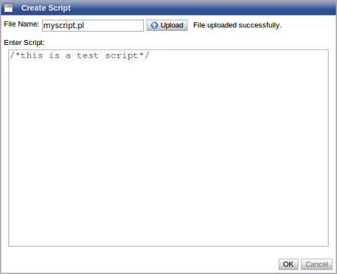
The <script-upload> element has no attributes, but has three child elements:
server-path> (required) - This specifies a temporary path on the server where the file should be uploaded. This must be a fully qualified path.Cloud-path> (required) - This specifies the final destination path of the file on the Cloud head. This must be a fully qualified path.form-submit> (optional) - This specifies an alternative Servlet or other form action URL.The server and Cloud paths must be different if you are using an ssh connection to the localhost for Moab, otherwise the file will be deleted.
<script-upload>
  <server-path>/tmp</server-path>
  <Cloud-path>/var/tmp</Cloud-path>
  <form-submit>/fileupload/script</form-submit>
</script-upload>

A SuggestBox is a text box or text area that displays a preconfigured set of selections that match the user's input. Suggest boxes are useful when there are too many choices to present to the user; so many that a select box would be unreasonable. It is also appropriate when the user can use an arbitrary string, but you want helpful suggestions to be available.
You can specify a suggest box using the <suggest-box> element to define the component. Viewpoint supports two types of suggest box components:
|
|
Inferred values incorporate well with suggest boxes. If using an inferred value script, have the script return the <suggest-box> root element and all its children. |
To specify the options for a suggest box in the XML, use the <suggestion> element. Here is an example:
<component id="manager-names" required="false">
  <description>Select Team Lead</description>
  <suggest-box>
    <suggestion>Scott Brown</suggestion>
    <suggestion>Brady Kimball</suggestion>
    <suggestion>Nathan Wells</suggestion>
    <suggestion>Nate Seeley</suggestion>
    <suggestion>Jared Mecham</suggestion>
    <suggestion>James Stoddard</suggestion>
    <suggestion>Ric Buhler</suggestion>
    <suggestion>Sean Reque</suggestion>
  </suggest-box>
</component>
|
|
Viewpoint uses its built-in intelligence engine to determine how many options are sent to the client when the form is created. If there are too many suggestions to send to the client, Viewpoint caches the suggestions on the server and passes more to the client when necessary. |
A dynamic suggest box calls a script to get the suggestions for the text box. Like the static suggest box model, use the <suggest-box> element but set the dynamic attribute to "true". Then, specify a URL in the same way you would specify an inferred value, as in the following example:
<component id="dynamic-names" required="false">
  <description>Dynamic</description>
  <suggest-box dynamic="true" source="exec">
    <url value="file:///home/user/tools/suggestions.pl" />
  </suggest-box>
</component>
The script outputs suggestions based on submitted inputs. The single argument to the script is the value of current text. Based on the preceding example, if "Bob" is submitted as input, it gets passed to the suggestions.pl file. Output is XML in the following format:
<response>
  <suggestion>My First Suggestion</suggestion>
  <suggestion>Second Suggestion</suggestion>
  ....
  <suggestion>Last Suggestion</suggestion>
</response>

A table map is a component that allows users the ability to add an arbitrary amount of key-value pairs. It is configured using the <table-map> element. This component consists of a table with three columns and an Add button at the bottom for adding more rows to the table. The first column is a icon to remove existing rows from the table. The component in the second column is the "key" component. All key components must have a unique value for the table map to be considered valid. The component in the last column is the "value" component.
To add a new key-value pair to the table, the user clicks Add. This adds a new row to the table with the three columns explained earlier. The user can then fill in the values for these components as desired. If the user wishes to remove the key and its corresponding value from the table, they click the Remove icon on left hand side to remove that row.
The table accepts any type of component for the key and value, except components that contain lists or are tables themselves. In other words, a table map with a key component of a table map is not allowed. To configure the key component, use the <key-component> element. Likewise, the value component is specified using the <value-component> element.
Here is an example of a table map component. In this example, the key is a list of generic resources and the value is the amount requested for each resource.
<component id="genericResources" required="false">
  <description>Generic Resources</description>
  <table-map>
    <key-component id="genericResourcesKey">
      <select-values>
        <select-value api-value="fastio" display-value="Fast I/O" />
        <select-value api-value="san" display-value="Extra Storage" />
        <select-value api-value="matlab" display-value="MATLAB Licenses" />
        <select-value api-value="matlab" display-value="MATLAB Licenses" />
        <select-value api-value="bandwidth" display-value="Bandwidth" />
      </select-values>
    </key-component>
    <value-component id="genericResourcesValue">
      <number-value type="int">
        <default>0</default>
        <minimum inclusive="true">0</minimum>
        <maximum inclusive="true">10000</maximum>
        <step>1</step>
      </number-value>
    </value-component>
  </table-map>
</component>
A text box is specified by using a <text-value> element. A text box allows users to input any string data into a field. Restrictions can be placed on the text box to define what the valid inputs are by using the <regex> element. The expression in this element is used to validate the input as defined by regular expression pattern matching. If no regular expression is set, all inputs are considered valid. Like other components, a default can be specified by using the <default> element. Use an <error-msg> element to clarify the purpose of an error in a message should the regex validation fail.
The following describes a text box component that must match /^\d{5}$/ (5-digit zip code) with a default value of 84043.
<component id="zip" required="true">
  <description>Zip Code</description>
  <text-value>
    <default>84043</default>
    <regex>^\d{5}$</regex>
    <error-msg>Zip code must be exactly 5 digits</error-msg>
  </text-value>
</component>
|
|
The regular expression in the <regex> element uses the JavaScript regular expression syntax. |
A password text box has the same functionality as any other text box with one exception: the input field visually masks its input to prevent eavesdropping. This is useful for sensitive data. This is a display change only and does not change the way the data is sent from the client to the server.
To specify that the text box should visually mask its data for passwords, set the type attribute to "password" in the <text-value> element. Here is an example:
<component id="requiredpasswd" required="true">
  <description>Enter a password:</description>
  <text-value type="password" >
    <regex>^\d{5}$</regex>
  </text-value>
</component>
This class represents a way to add requirements and rules to components. A component rule consists of two parts:
The requirement can be any boolean decider. It is evaluated when any of the components change.
The response can do one of the following operations:
To change the selectable options in a list box, the XML must specify a single select list box using the <component> element and then specify the allowable options via the <select-values> element.
Here is an example of a component rule that changes the memory component options to 1, 2, or 4 GB if the user selects "1" as the value for the procs component:
<component-rule>
  <requirement comparison="equals">
    <first>
      <component id="procs" />
    </first>
    <second>1</second>
  </requirement>
  <response>
    <component id="memory">
      <select-values>
        <select-value api-value="1" display-value="1 GB" />
        <select-value api-value="2" display-value="2 GB" />
        <select-value api-value="4" display-value="4 GB" />
      </select-values>
    </component>
  </response>
</component-rule>
To edit a component's visibility, the XML must specify the component using the <component> element and then specify the visibility of the component using the <display> element. The text for the <display> element is true or false.
Here is an example where a component is made invisible when a certain value is set:
<component-rule>
  <requirement comparison="equals">
    <first>
      <component id="script-chooser" />
    </first>
      <second>Write New</second>
  </requirement>
  <response>
    <component id="upload-script">
       <display>false</display>
    </component>
    <component id="write-script">
       <display>true</display>
    </component>
  </response>
</component-rule>
Similar to the component visibility, per section visibility can be set in a component rule's response. The syntax is similar to component rules. An example is as follows:
<component-rule>
  <requirement comparison="equals">
    <first>
      <component id="script-chooser" />
    </first>
      <second>Write New</second>
  </requirement>
  <response>
    <component id="scriptsection">
      <display>true</display>
    </component>
  </response>
</component-rule>
Through component responses, individual components may become valid or invalid by using the <validate> element. When a component is invalidated through a component response, only another component response may re-validate the component.
To invalidate components, use the <invalidate-components> element. Optionally, you may specify the invalidation to be strict, which means the user cannot proceed until the component is re-validated. An example follows:
<response>
  <invalidate-components strict="true">
    <message>These are not valid values</message>
    <component id="ip-address" />
    <component id="firewall" />
  </invalidate-components>
</response>
To set a component to valid status (again), use the <validate-components> element; for example:
<response>
  <validate-components strict="true">
    <component id="ip-address" />
    <component id="firewall" />
  </validate-components>
</response>
|
|
Because component rules can be dynamic, meaning they can be returned from the server, you may prefer to use them as opposed to existing validation framework. For example, you could have an external script verify that a username is valid, possibly invalidating the username component. |
Viewpoint can make a remote procedure call (RPC) that executes a script on the Web server to determine a component's response. In such a case, when the component rule is evaluated to true, the script specified in the XML configuration executes. Upon completion, that script returns XML describing another type of component response, which then runs on the client. This makes it possible to perform more complex operations to change the user interface state dynamically.
Administrators configure a dynamic component response using the source attribute for the <response> element. The source attribute can be either file if the source is a file or exec if the source is an executable:
If the source of the dynamic component response is a script, Viewpoint can pass inputs to the script. This may be required for more complex operations where the component response is dependent on multiple factors. Administrators specify required input parameters using the <input> element. This optional element accepts one or more <component id="X"> elements, where the component id corresponds to the component required. This information is sent to the client in XML as a single input parameter.
Example:
In the XML configuration file, the administrator configures the following component rule to execute the getFirewallOptions.py script:
<component-rule>
  <requirement>
    <component id="enable-firewall-checkbox" />
  </requirement>
  <response source="exec">
    <url value="file:///home/user/tools/getFirewallOptions.py" />
    <input>
      <component id="ip-address" />
    </input>
  </response>
</component-rule>
The getFilewallOptions.py script requires the value of the user-specified ip address component. Assume for this example the value of the ip-address component is 192.168.99.120. When the user clicks the appropriate checkbox, the script is called in the following manner:
/home/user/tools/getFirewallOptions.py xml='<components> <component id="ip-address"> <value>192.168.99.120"</value> </component> </components>
The script returns XML representing a component response, an example of which follows:
<response>
 <component id="LAN-options">
  <display>true</display>
 </component>
 <component id="WAN-options">
  <display>false</display>
 </component>
</response>