8.1 Node Management |

|
8.1 Node Management |
|
The Node Management page works with the VM Management Page and consists of a table grid that displays nodes with drill through capability for viewing VMs, a set of buttons above the table for operating on one or more rows selected in the table, and configurable panels for displaying individual nodes in detail. All these components can be configured in nodes.xml. The format of the related XML is give below.
<nodes>
  ...
  <node-management>
    <controls>
      ...
    </controls>
    <table>
      ...
    </table>
    <node-details>
      ...
    </node-details>
    <vm-details>
      ...
    </vm-details>
  </node-management>
  ...
</nodes>
The Node Management table can be configured at the column-level to show different attributes for nodes. The relevant XML section for configuring the table is nodes > node-management > table > fields. Each child element of the fields element corresponds to a single column, and the columns will appear in the same order that the child elements are specified. The name of each element corresponds to the type of the column. This type knows how to extract a piece of information from a table record to display in the column, and also contains sensible defaults for display options of the column. The currently allowed field types are:
access-policy>alias>architecture>disk-available>disk-total>disk-utilized>features>hypervisor-type>id>ip-address>link-id>load>memory-available>memory-total>memory-utilized>os>pending-actions>power>power-policy>priority>processors-available>processors-total>processors-utilized>state>status>substate>type>vlans>vm-link> - Formatted with number of VMs on hypervisor, but also as a link to VM Management Page with appropriate filter. Should be used in the table for linkingvm-count> - Formatted to return string value of number of VMs on hypervisorAll field types have these attributes:
primary (optional) - Default is "false". Specifies whether this field forms part or all of primary key for the table records.visible (optional) - Default is "true". Specifies whether the column should displayed or be hidden.width (optional) - Specifies the width in pixels of the column.All field types have this child element:
title> (optional) - The name of the column to be displayed to the user.In addition to the above fields, the <table> element supports a special kind of column named "composite". The composite column allows you to display a value based on the basic fields listed above by using the value decider framework. Each field can be accessed with <component> elements. You must specify a width and a title for the <component> element. The contents of the <value> element constitute the value decider portion that determines the form of the column values. The basic structure of a <composite> element is below:
<composite width="100">
  <title>Column title</title>
  <value>
    ...
  </value>
</composite>
An example of a composite value is one that displays both the available disk space and the total configured disk space on nodes and VMs in gigabytes. Disk values are reported directly as given by Moab. If Moab is reporting disk values in megabytes, you could configure the composite value as shown in the example below. This example displays a column value of the form <disk available in GB> / <disk total in GB>.
<composite width="75">
  <title>Disk (GB)</title>
  <value>
    <calculate operation="append-in-order">
      <value order="1">
        <calculate operation="double-to-string"
        format="#.#">
          <calculate binary-operation="multiply">
            <first>
              <component id="disk-available"/>
            </first>
            <second>.0001</second>
          </calculate>
        </calculate>
      </value>
      <value order="2"> / </value>
      <value order="3">
        <calculate operation="double-to-string"
        format="#.#">
          <calculate binary-operation="multiply">
            <first>
              <component id="disk-total"/>
            </first>
            <second>.0001</second>
          </calculate>
        </calculate>
      </value>
    </calculate>
  </value>
</composite>
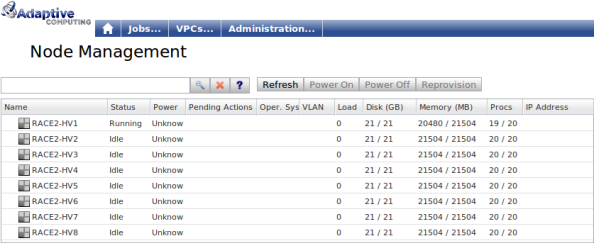
An example node table configuration is given below:
<node-management>
  <table>
    <fields>
      <id primary="true" width="150">
        <title>Name</title>
      </id>
      <status/>
      <power/>
      <pending-actions width="100"/>
      <os width="60">
        <title>Op. Sys.</title>
      </os>
      <vlans>
        <title>VLAN</title>
      </vlans>
      <load/>
    </fields>
  </table>
</node-management>
The values reported by the state, substate, and status fields can be customized using the localization framework (see Tailoring Semantics to Specific Markets or Customers). Add the value to be replaced to the market.properties configuration file, followed by an '=,' and then the value that will replace it. For example, adding Drained = Admin down will cause "Admin Down" to show up in the Node Management table if the status "Drained" is reported for a node.
In order for many features of the Node Management page to work properly, you must configure at least one field to be a primary key field. We strongly recommend creating an id field as the sole primary key field. You can make this field invisible if you don't want users to see it.
The following table filters are supported:
You can control the way nodes are displayed using Moab. If nodes are set up using the variable VP_IS_VISIBLE=false, they will not be displayed on the Node Management page. If the variable is set to anything other than "false", or if the variable is not present in a node, the node will be displayed normally, which is the default.
Node visibility can also be controlled based on a user's principals with the VP_VIEW_PRINCIPALS variable. See Configuring Viewpoint Security for more information about user principals. The variable specifies a set of user principals, delimited by the | character, necessary to access the node. A user must have only one of the specified principals to view the node. The following example demonstrates how to set up the VP_VIEW_PRINCIPALS variable:
mnodectl node01 -m variable=VP_VIEW_PRINCIPALS=admin|poweruser|operator

|
Users must have the node.read permission to access nodes. The VP_IS_VISIBLE and VP_VIEW_PRINCIPALS variables do not set permissions, but limit them. |

The above-table controls perform actions based on items like the currently selected table records. The above-table buttons are configured in the <controls> child element of <node-management>. Supported elements are listed below. Note that some buttons are only valid for a particular record type (node or VM). Buttons disable themselves when their surrounding context is invalid such as if the button requires a selected record but no table record is selected, or if the type of the selected record doesn't apply to the button.
power-off> - Powers off selected nodes.power-on> - Powers on selected nodes.refresh> - Refreshes the table and any open details panel.reprovision> - Reprovisions all selected nodes.show-pending-actions> - Redirects to the pending actions page for the currently-selected node.modify-host-reservations> - Displays a popup listing all host-based reservations that include the selected node in their host expression. Users can then remove reservations from the node by either shrinking them or by deleting them if they exist only on the selected node.remove-admin-reservations> - Removes all host-based user reservations from the selected nodes. If these reservations would then become empty, they are deleted instead.In addition to specifying an action type via the element's name, you can configure the display of the button using any of the following attributes.
image-url (optional) - Path to an icon that will be used to display the button. label (optional) - Text to be displayed either on the button or, if an image is specified, to its right side. tooltip (optional) - Tool-tip to be displayed on the button when the mouse hovers over it. You can also specify the permission access for each button with the <permissions> child element. This element can contain a sequence of <permission> elements that specify a Viewpoint permission a user needs in order to see and use the button. An example permissions configuration might be:
<power-off>
  <permissions>
    <permission name="node.update"/>
  </permissions>
</power-off>
In this example, a user can use the power-off button only if they have the node.update permission.
The Node management page contains a panel for displaying a node in detail. These sections are configured in the nodes > node-management > details element. These panels currently allow one to configure a title, a set of controls, and a list of sections to display information in. The title can contain field references that will be replaced with the value of the field of the current object being viewed. Allowable fields are those available for the node table. Most of these fields are specified by prefixing a field name with $ and optionally wrapping it in curly brackets. Examples include $id, ${name}, and $cpu. In addition, one can display a variable in the title using the map variable syntax, which suffixes the field name with a key enclosed in square brackets. For example, the reference $variable[VLAN] would be substituted with the value of the variable "VLAN" in the title.
Each details panel contains a buttons section that has the same structure as the above-table buttons. They actually support an arbitrary menu structure, but that structure is more likely to be used in the details panel. That is, in addition to the button elements described above, a submenu can be created with a menu element that itself contains child elements. Arbitrarily nested menus can thus be created. Besides containing child elements, a menu element can also specify a boolean attribute vertical, which defaults to "true", that specifies the menu's layout direction. Furthermore, a menu itself can have permissions just like a button. If a user doesn't have permissions to view a menu, then he or she will not see the menu or any of its sub-elements.
The scope of a details panel button is the panel itself. Because of this, buttons that require a record to be selected in the node table, if they were placed above the table, treat the record displayed in the details panel as the selected record. Also, the refresh button refreshes only the details panel.
An example node buttons configuration is:
...
<node-details>
  <controls>
    <menu vertical="true" image-url="images/vm-menu.png" tooltip="Perform VM operations on this hypervisor">
      <create-vm image-url="images/vm-create-green.png" tooltip="Create a new VM" label="Create VM..."/>
      <destroy-all-vms image-url="images/vm-destroy.png" tooltip="Destroy all VMs on this hypervisor" label="Destroy VMs"/>
      <reprovision-all-vms image-url="images/reprovision.png" tooltip="Reprovision all VMs on this hypervisor" label="Reprovision VMs..."/>
      <migrate-all-vms image-url="images/migrate.gif" tooltip="Migrate VMs away from this hypervisor" label="Migrate VMs..."/>
      <start-all-vms image-url="images/play.png" tooltip="Starts all VMs on this hypervisor" label="Start VMs"/>
      <stop-all-vms image-url="images/stop.png" tooltip="Stops all VMs on this hypervisor" label="Stop VMs"/>
    </menu>
  </controls>
</node-details>
The node details panel supports all the above-table buttons. In addition, it supports the following extra buttons:
create-vm> destroy-all-vms>toggle-node-power>migrate-all-vms>remove-node>start-all-vms>stop-all-vms>The <toggle-node-power> element, in addition to the standard button configuration, allows you to configure a custom button look for when the button can turn off a node, and another button look for when the button can turn a node on. This is done with the <on-button> and <off-button> child elements. An example is given below:
<toggle-node-power>
  <on-button image-url="images/power-green.png" tooltip="Power on server"/>
  <off-button image-url="images/power-red.png" tooltip="Power off server"/>
</toggle-node-power>
Each details panel section specified in XML corresponds to a collapsible section in the details panel. A section itself consists of a title (with no variable interpolation) and a <fields> element that contains a list of fields. These fields have names that correspond directly to the table fields described previously in the fields section.
In addition, the following fields are supported for both panels:
|
|
Several fields actually display a collection or list of scalar values. By default, these values are printed as a label of comma-separated values. However, if the field is given the attribute multiline="true", the field is displayed as a multi-select box with each individual collection value displayed on its own line. The fields that currently have this feature are labeled as collection fields. |
classes> - A collection.generic-events> - A table.generic-metrics> - A table.generic-resources> - A table.header> - This is used to add a line of header text meant to be a sub-header inside a details section or to separate groups of values in a details section. jobs> - A collection.os-options> - A collection.reservations> - A collection.resource managers> - A collection.variables> - A table.virtual-machines> - A collection.vm-os-options> A collection.The Node Management Page can contain links to the VM Management Page. By including the <vm-count> tag in the node-management->table->fields->vm-count location a link to each Node's VMs makes it possible to navigate to the VM Management Page with the page filtered on the linking node. Note: The VM Management Page must contain the parent field.