|
You are here: 5.0 Virtual Private Clouds > Customizing VPC Functionality (vpcs.xml) > VPC Management
|
|
5.1.2 VPC Management |

|
|
You are here: 5.0 Virtual Private Clouds > Customizing VPC Functionality (vpcs.xml) > VPC Management
|
|
5.1.2 VPC Management |
|
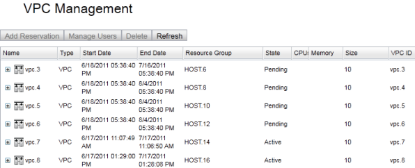
The VPC Management page has a table for displaying VPCs and reservations, a set of buttons above the table for operating on a row selected in the table, and configurable panels for displaying individual VPCs or reservations in detail. All these components can be configured in vpcs.xml. The format of the related XML is given below.
<vpcs>
  ...
  <vpc-management>
    <controls>
      ...
    </controls>
    <table>
      ...
    </table>
    <vpc-details>
      ...
    </vpc-details>
    <reservation-details>
      ...
    </reservation-details>
  </vpc-management>
</vpcs>
By default, users can only see their own VPCs (even administrators). To allow users to see all VPCs, they must have the vpc.readall permission.
The VPC Management table can be configured at the column-level to show different attributes for VPCs and reservations. To do so, modify the <fields> child element of the <table> element. Each child element of <fields> corresponds to a single column and the columns appear in the same order that the child elements are specified. The name of each element corresponds to the type of the column. This type knows how to extract information from a table record to display in the column and also contains sensible defaults for display options of the column. The allowed field types are:
cpu> disk-size> duration> - Pseudo-field that derives the duration of an object from its start and end date. end-date> id> label> memory> name> - Pseudo-field that displays an object's label if it exists, or otherwise the id of the object. owner> resource-group> start-date> state> type> - Pseudo-field that displays "VPC" or "Reservation" based on the type of the particular record. These display values are configurable via Viewpoint's marketization feature. variable> - Displays an individual variable on a table record. A name attribute is required. The value of name is displayed as the column title.rsv-type> - Displays whether the virtual machine is "Physical" or "Virtual".All field types have these attributes:
primary (optional) - Default is "false". Specifies whether this field forms part or all of primary key for the table records. visible (optional) - Default is "true". Specifies whether the column should be displayed or hidden. All field types have this child element:
title> (optional) - The name of the column to be displayed to the user.
In addition to the above fields, the <table> element supports a special kind of column named "composite". The composite column allows you to display a value based on the basic fields listed above by using the value decider framework. Each field can be accessed with <component> elements. You must specify a width and a title for the <component> element. The contents of the <value> element constitute the value decider portion that determines the form of the column values. The basic structure of a <composite> element is below:
<composite width="100">
  <title>Column title</title>
  <value>
    ...
  </value>
</composite>
An example VPC table configuration is given below:
<vpc-management>
  <table>
    <fields>
      <id primary="true" visible="false"/>
      <name width="100"/>
      <type/>
      <start-date/>
      <end-date/>
      <resource-group/>
      <state/>
      <cpu>
        <title>CPUs</title>
      </cpu>
      <memory/>
      <disk-size>
        <title>Size</title>
      </disk-size>
      <variable name="VPCID">
        <title>VPC ID</title>
      </variable>
    </fields>
  </table>
</vpc-management>
In order for many features of the VPC Management page to work properly, you must configure at least one field to be a primary key field. We strongly recommend creating an id field as the sole primary key field. You can make this field invisible if you don't want users to see it.
(Since Viewpoint 2.0 only) If any reservation has the "VP_IS_VISIBLE" variable set to "false", Viewpoint will not show this reservation in the VPC management page. This variable can be used to hide reservations that contain supplemental resources to the main virtual machine reservation.

The above-table buttons are configured in the <controls> child element of <server-management>. Supported elements are listed below. Note that some buttons are only valid for a particular record type (VPC or reservation). Buttons disable themselves when their surrounding context is invalid such as if the button requires a selected record but no table record is selected, or if the type of the selected record doesn't apply to the button.
add-reservation> - Opens a dialog for adding a reservation to the selected VPC.archive-reservation> - Opens a dialog for archiving the selected reservation.clone-reservation> - Opens a dialog for cloning the selected reservation.delete> - Deletes the selected table record.manage-users> - Opens a dialog for managing user permissions on the selected VPC.modify-reservation> - Opens a dialog for modifying the selected reservation.modify-vpc-duration> - Opens a dialog for modifying the duration of the selected VPC.refresh> - Refreshes the table data from the server, as well as the data for any object being viewed in a details panel.restore-reservation> - Restores an archived reservation onto the selected VPC.In addition to specifying an action type via the element's name, you can configure the display of the button using any of the following attributes.
tooltip (optional) - Tool-tip to be displayed on the button when the mouse hovers over it.label (optional) - Text to be displayed either on the button or, if an image is specified, to its right side.image-url (optional) - Path to an icon that will be used to display the button.You can also specify the permission access for each button with the <permissions> child element. This element can contain a sequence of <permission> elements that specifiy a Viewpoint permission a user needs in order to see and use the button. An example permissions configuration might be:
<manage-users>
  <permissions>
    <permission name="vpc.update"/>
    <permission name="vpc.users"/>
  </permissions>
</manage-users>
In this example, a user can only use the manage-users button if they have the vpc.update permission and the vpc.users permission.
The VPC Management page contains two panels, one for displaying a VPC in detail and the other for displaying a reservation in detail. These sections are configured in the <vpc-details> and <reservation-details> child elements of <vpc-management>. You can configure a title, a set of buttons, and a list of sections that display information in these panels. The title can contain field references that are replaced with the value of the field of the current object being viewed. Allowable fields are those available for the VPC table. Most of these fields are specified by prefixing a field name with a dollar sign ($) and optionally wrapping it in curly brackets({}). Examples include $id, ${name}, and $cpu. Additionally, you can display a variable in the title using the map variable syntax, which suffixes the field name with a key enclosed in square brackets. For example, the reference $variable[VPCID] would be substituted with the value of the variable "VPCID" in the title.
Each details panel contains a buttons section that has the same structure as the above-table buttons. They actually support an arbitrary menu structure, but that structure is more likely to be used in the details panel. That is, in addition to the button elements described above, a submenu can be created with a menu element that itself contains child elements. Arbitrarily nested menus can thus be created. Besides containing child elements, a menu element can also specify a boolean attribute vertical, which defaults to "true", that specifies the menu's layout direction. Furthermore, a menu itself can have permissions just like a button. If a user doesn't have permissions to view a menu, then he or she will not see the menu or any of its sub-elements.
The scope of a details panel button is the panel itself. Because of this, buttons that require a record to be selected in the VPC table, if they were placed above the table, treat the record displayed in the details panel as the selected record. Also, the refresh button refreshes only the details panel.
An example reservation buttons configuration is:
<reservation-details>
  <controls>
    <menu label="Reservation Actions"/>
      <permissions>
        <permission name="reservation.update"/>
      </permissions>
    <clone-reservation/>
      <modify-reservation/>
      <delete>
        <permissions>
          <permission name="reservation.delete"/>
        </permissions>
      </delete>
    </menu>
  </controls>
</reservation-details>
The VPC details panel supports the generic above-table buttons (Refresh and Delete), as well as the VPC-specific above-table buttons (Add-reservation, Manage-users, Modify-VPC-duration, and Restore-reservation).
The reservation details panel supports the generic above-table buttons (Refresh and Delete) as well as the reservation-specific above-table buttons (Modify-reservation, Clone-reservation, and Archive-reservation).
Each details panel section specified in XML corresponds to a collapsible section in the details panel. A section itself consists of a title (with no variable interpolation) and a <fields> element that contains a list of fields. These fields have names that correspond directly to the table fields described previously in the fields section.
In addition, the following fields are supported for both panels:
variables> - This is used to display a list of all variables on the record.authorization> - This is used to display ACL information in a text area.header> - This is used to add a line of header text meant to be a sub-header inside a details section or to separate groups of values in a details section.reservations> - This displays the list of reservations on the VPC in a text area.You can expand the sample code window below for an example of what a complete VPC details panel might look like:
<vpc-details>
  ...
  <sections>
    <section>
      <title>General</title>
      <fields>
        <name/>
        <owner/>
        <state/>
        <cost/>
      </fields>
    </section>
    <section>
      <title>Time</title>
      <fields>
        <start-date/>
        <end-date editable="true"/>
        <duration/>
      </fields>
    </section>
    <section>
      <title>resources</title>
      <fields>
        <resource-group/>
        <reservations/>
      </fields>
    </section>
  </sections>
</vpc-details>
Only one field is supported as being editable—the VPC details <end-date> field. The above example shows how to configure the field to be editable. The editable <end-date> field allows a user to select an end date with a date picker at the granularity of days instead of months and provides no means of configuring any logic related to fiscal year end dates.