(Click to open topic with navigation)
Service templates > Service template references > Fields: Catalog options
6.1.11 Fields: Catalog options
Path: Administration > Catalog Management > New/Edit > Resources > Add field
The "Catalog options" section of the Resources tab lets you add custom fields to your service template. You can add one of several field types. (The options and associated fields change depending on the field type you select.)
Common fields
Standard fields
These three fields are standard in every new field you add:
Field type
Lets you specify a which type of field you want to add to your service template. You can choose from the following options:
Label
Lets you specify the descriptive label (or name) of the field. What you specify in this field is what the user will see in the form.
This field is not required.
ID
Lets you specify the unique identifier for the field. The value you specify should correspond to one of the following:

If the value you specify in the ID field does not match one of the Moab Web Services keywords and you select the Schedulable resource option, Viewpoint assumes the field is a Moab generic resource. Otherwise, Viewpoint assumes the ID value is a variable.
If you want to specify a generic resource ID, the ID field value must match the exact name of the generic resource configured in Moab. (See the "Moab Managing Consumable Generic Resources" documentation in the Moab Workload Manager Admininstrator Guide for more information on generic resource configuration.)

The ID value must be unique for every new field you add.
Additional options
Some fields have the one or more of the following additional options:
Editable by user
Lets you specify whether or not the user will be allowed to modify the specifications of the resource.
If you select this option, you must be sure you specify a default value. Failing to do this will leave a blank field that the user will not be able to do anything with.
Schedulable resource
Lets you specify whether the field represents a schedulable resource. When a field is marked as a schedulable resource, its value must be an integer. If you do not select this option, Viewpoint assumes the field is a variable, and its value can be non-numeric.
The Schedulable resource option is, in essence, an attribute that allows you to define the type of data being written. For example, if you select Schedulable resource when defining a text field with the ID set to "bob" and the Value set to "5", then the service request would have an "attributes" section like this (with the "bob" key-value pair written to the resources object in the service request):
attributes: {
moab: {
job: {
resources: {
bob: "5"
},
variables: {
}
}
}
}
If you left the Schedulable resource option unchecked, then the same input field would be interpreted as a variable (written in the variable object):
attributes: {
moab: {
job: {
resources: {
},
variables: {
bob: "5"
}
}
}
}
Visible to user
Lets you specify whether or not the field will appear in the user service template form.
When you select this option, the Editable by user option will automatically clear. (If a user cannot see the field, they cannot edit it.)
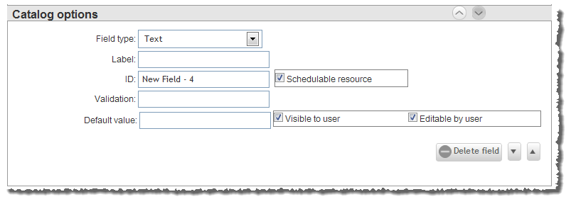
Text
Creates a field in which a user can specify any string data. For example:

Validation
Lets you specify a regular expression (using JavaScript regex syntax) that will check and validate the user input on this field.
This validation causes Viewpoint to notify users when they enter something invalid in the field. (For information about regular expressions, please see http://www.regular-expressions.info/.)
Default value
Lets you specify a value that will be pre-populated in the field when the user opens the form.
If you have not selected the Editable by user option (meaning the user cannot edit the field), then the default value will be the only option for the user. If you want the user to be able to choose from more than the default value, make sure you select the Editable by user option.
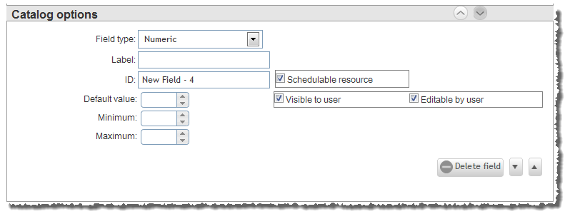
Numeric
Creates a number spinner in which a user inputs numeric data. For example:

Default value
Lets you specify a number value that will be pre-populated in the field when the user opens the form.
You must make sure that the Default value is greater than or equal to the Minimum value and less than or equal to the Maximum value.
If you have not selected the Editable by user option (meaning the user cannot edit the field), then the default value will be the only option for the user. If you want the user to be able to choose from more than the default value, make sure you select the Editable by user option.
Minimum
Lets you specify the minimum value that will appear in the number spinner. In other words, it lets you specify the smallest number that the user may request of the resource.
Maximum
Lets you specify the maximum value that will appear in the number spinner. In other word, it lets you specify the largest number that the user may request of the resource.
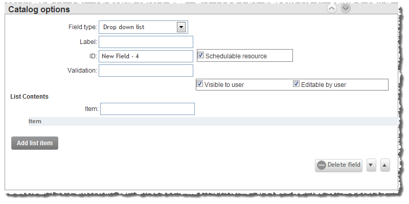
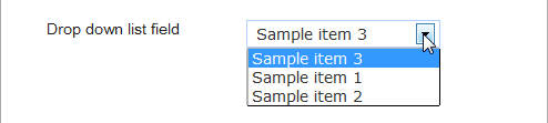
Drop down list
Creates a list field in which the user may choose from one or more predefined options. For example:
Validation
Lets you specify a regular expression (using JavaScript regex syntax) that will check and validate the user input on this field.
This validation causes Viewpoint to notify users when they enter something invalid in the field. (For information about regular expressions, please see http://www.regular-expressions.info/.)
Item
Lets you specify an option that will appear in the drop down list. The content you provide for this field is simply a predetermined value (as in a key-value pair).
When you have populated the Item field with the value you want, click Add list item.
The first item you add to the list (the top item) will be the default value.
Add list item
Lets you add the content of the Item field to the drop down list. If you want to remove an item from the list, click Remove.
Remove
Lets you remove an item from the drop down list.
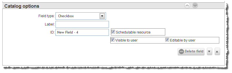
Checkbox
Creates a checkbox that the user clicks to indicate that a value is true. For example:

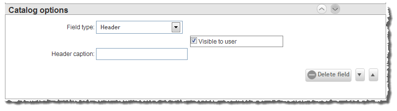
Header
Creates a display-only, organizational header to categorize fields and set them apart from others. For example:

Because this field is for display only, there is no Label field or ID field associated with it.
Header caption
Lets you specify the text that will appear in a field group heading.
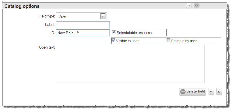
Open
Creates a custom field that you configure with HTML, JavaScript, etc.
Open text
Lets you specify HTML, JavaScript, etc. for a custom field.
You must take special care when using the Open field, because the code you provide can be executed by the end user.
In the case that you use JavaScript, it is recommended that you use jQuery. However, there are two things that you should be aware of:
- Where you would normally use the jQuery(document).ready() function, you will need to instead use an onTemplateLoad function, in this manner:
onTemplateLoad (function(event, currentTemplate) {
// code
});
- If you want to use a jQuery selector in the form of jQuery("#id"), you will need to instead use a findLocally function in the form of findLocally("id", currentTemplate).
The reason for this is that Viewpoint will cause the ID to be unique (alter it) across all the templates on the form.
For example, if you were to construct an input with the ID of "alpha" and then turn it into a number-spinner input, normally you would use the following JavaScript:
<input id="alpha" name="alpha" />
<script type="text/javascript">
jQuery(document).ready(function() {
jQuery("#alpha").spinner();
});
</script>
However, to have this same functionality in a Viewpoint Open field, you should use the onTemplateLoad and findLocally methods, as follows:
<input id="alpha" name="alpha"/>
<script type="text/javascript">
onTemplateLoad(function(event,currentTemplate){
findLocally("alpha", currentTemplate).spinner();
});
</script>
Here is a list of some things you can do with the Open field:
-
You can use a script to send field values to a web service for validation. Here is a generic example of what this script would look like (with the returned JSON).
<label>Input A</label>
<input id="alpha" name="alpha" class="required"/>
<br clear="all" />
<label>Input B</label>
<input id="beta" name="beta" class="required" />
<script type="text/javascript">
onTemplateLoad(function(event,currentTemplate){
var nodeA = findLocally("alpha", currentTemplate);
var nodeB = findLocally("beta", currentTemplate);
var updateValidation = function(){
jQuery.ajax({
type : "GET",
url : "/moab/serviceTemplate/validateInput",
data :{ nodeA: nodeA.val(), nodeB: nodeB.val() },
contentType : "application/json; charset=utf-8",
async: false,
error : function(xhr, status, error) {
nodeA.rules("add",{required:true});
nodeA.rules("add",{regex:"$^"});
nodeB.rules("add",{required:true});
nodeB.rules("add",{regex:"$^"});
},
success : function(responseStr) {
var response = eval("(" + responseStr + ")");
if (response.result){
nodeA.rules("remove"); nodeB.rules("remove");
}
else {
var validationConfig = {
regex:"$^",
messages:{ regex: response.message }
}
nodeA.rules("add",{required:true});
nodeA.rules("add", validationConfig);
nodeB.rules("add",{required:true});
nodeB.rules("add",validationConfig);
}
}
});
}
nodeA.change(updateValidation);
nodeB.change(updateValidation);
});
</script>
//Example JSON to send to web service
{
nodeA : "<value>",
nodeB : "<value>"
}
// Example JSON response from web service
{
success : false,
message : "<message>"
}
- If you want to create an input that is not saved to the service (such as filtering lists or radio buttons that toggle other sections), add the noSave class to the input. Inputs containing the noSave class are not sent to the service generation system as a variable or resource. For example:
<input ID='myInput' class='noSave'>
- If you want an open field to be a schedulable resource, you can set the isresource attribute to "true". For example:
<input id='bob' value='5' isresource='true' />
This input would result in a service request like the following:
attributes: {
moab: {
job: {
resources: {
bob: "5"
},
variables: {
}
}
}
}
- If you want to create an input that saves custom data to a service request (for example, because you wanted a web service plug in to find the data and execute additional actions), you can set the shareddata attribute in the input to "true". For example:
<input ID='bob' value='5' shareddata='true' />
This input would result in a service request like the following:
attributes: {
moab: {
job: {
resources: {
},
variables: {
}
}
},
sharedData: {
bob: "5"
}
}
You can also pass JSON objects via the input field. For example:
<input ID='bob' value='{"hello":"there"}' shareddata='true' />
This input would result in a service request like the following:
attributes: {
moab: {
job: {
resources: {
},
variables: {
}
}
},
sharedData: {
bob: {
hello: "there"
}
}
}
The ID values you specify must be unique from other field ID values, including those in the Required resources section of the template form.
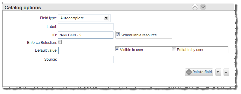
Autocomplete
Creates a text box in which the user begins typing and suggestions appear beneath the box. The user clicks, or uses the arrow keys to navigate to, a pre-determined suggestion to insert into the field. For example:
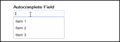
Enforce Selection
Specifies that you want to ensure the user input matches one of your suggested values. In other words, when you check this option, the user will not be allowed to submit a value that is different than one of your suggested values.
Default value
Lets you specify a value that will be pre-populated in the field when the user opens the form.
If you have not selected the Editable by user option (meaning the user cannot edit the field), then the default value will be the only option for the user. If you want the user to be able to choose from more than the default value, make sure you select the Editable by user option.
Source
Lets you specify the JSON array that determines the autocomplete field suggestions. You can specify the JSON array in one of two ways:
- Manually enter the JSON array.
- Specify a web service URL that returns a JSON array.
The JSON array (whether entered manually or returned from a web service URL) should consist of a series of objects, each of which has a "label and "value" entry. For example:
[
{"label":"1","value":"1"},
{"label":"2","value":"2"},
{"label":"2a","value":"2a"}
{"label":"2b","value":"2b"},
{"label":"2c","value":"2c"},
{"label":"3","value":"3"},
{"label":"31","value":"31"}
]
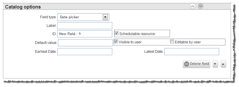
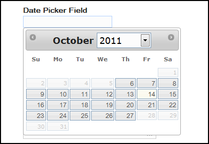
Date picker
Creates a field in which the user specifies a date value by navigating to the date in a pop-up calendar and selecting it. For example:
Default value
Lets you specify the date that appears in the field by default. You select the date from a pop-up calendar.
You must make sure that the Default value is before or equal to the Latest Date value and after or equal to the Earliest Date value.
If you have not selected the Editable by user option (meaning the user cannot edit the field), then the default value will be the only option for the user. If you want the user to be able to choose from more than the default value, make sure you select the Editable by user option.
Earliest Date
Lets you specify the earliest date possible the user can select. You select the date from a pop-up calendar.
Latest Date
Lets you specify the latest date possible the user can select. You select the date from a pop-up calendar.
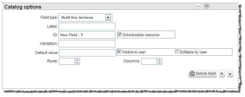
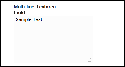
Multi-line text area
Creates a custom-sized field in which the user can input any string data. For example:
Validation
Lets you specify a regular expression (using JavaScript regex syntax) that will check and validate the user input on this field.
This validation causes Viewpoint to notify users when they enter something invalid in the field. (For information about regular expressions, please see http://www.regular-expressions.info/.)
Default value
Lets you specify a value that will be pre-populated in the field when the user opens the form.
If you have not selected the Editable by user option (meaning the user cannot edit the field), then the default value will be the only option for the user. If you want the user to be able to choose from more than the default value, make sure you select the Editable by user option.
Rows
Lets you specify the number of rows the multi-line text field will have.
Columns
Lets you specify the number or columns the multi-line text field will have.
Related topics